For a mobile app to stand out, it must be in line with the latest trends. For this reason, companies and mobile application developers must follow current design trends. So what are the mobile app UI design trends of 2022?
We have compiled it for you!
2022 Design Trends
- Animation
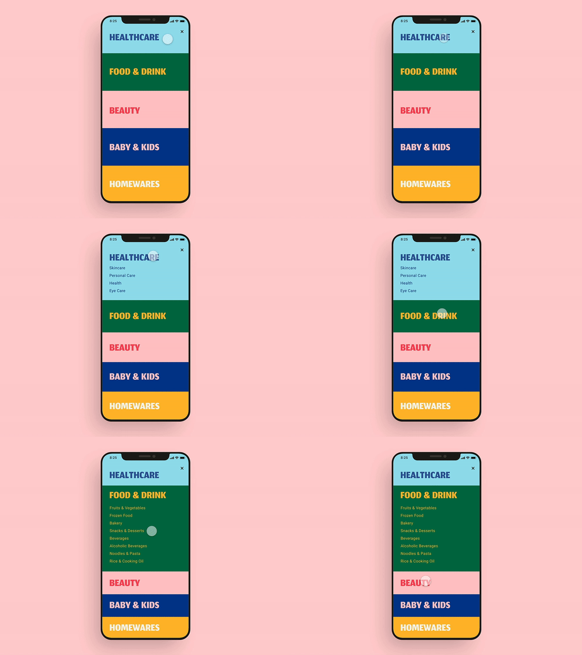
We all like to watch videos and spend a lot of time on TikTok or YouTube. Video contents and animations are more engaging and interactive.
Statistics show that most people watch explainer videos before using an app. Animation and motion design trends make content more engaging. It is easier to consume information when you have a practical example in front of you. Unlike static content with long descriptions, animation grabs users’ attention and makes the app more attractive.
It’s always a good idea to highlight the essential things with the animation trend. For example, you can animate buttons in your app to make user interaction with an app better and simpler. Micro gestures like icon animation can change your app significantly.
With the help of an animation, you can highlight app features, improve conversion rates and even sales.
Explore advanced animation: simple gestures no longer work for users. Use more complex transitions and differentiate animation approaches.
2. Mobile Gestures and Ui Swipe
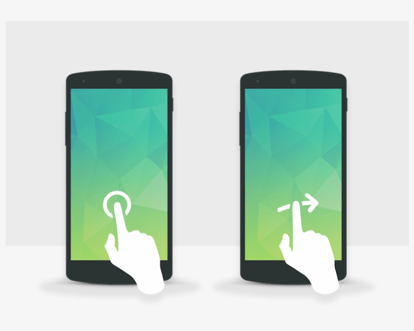
Swipe experiences are what make mobile devices more appealing in front of computers. Plus, it’s just more fun to swipe.
We spend hours every day swiping. Buttons and additional actions can be distracting and distracting.
This design trend has become one of the highest priorities for modern app design. Some app creators don’t support the use of buttons at all. Buttons create clutter and take up a lot of screen space. And the gesture design trend suggests replacing the button with the scroll function.
It may be helpful to try the animation for scroll actions. Book apps often use animation to turn pages, for example.
3. Dark Mode
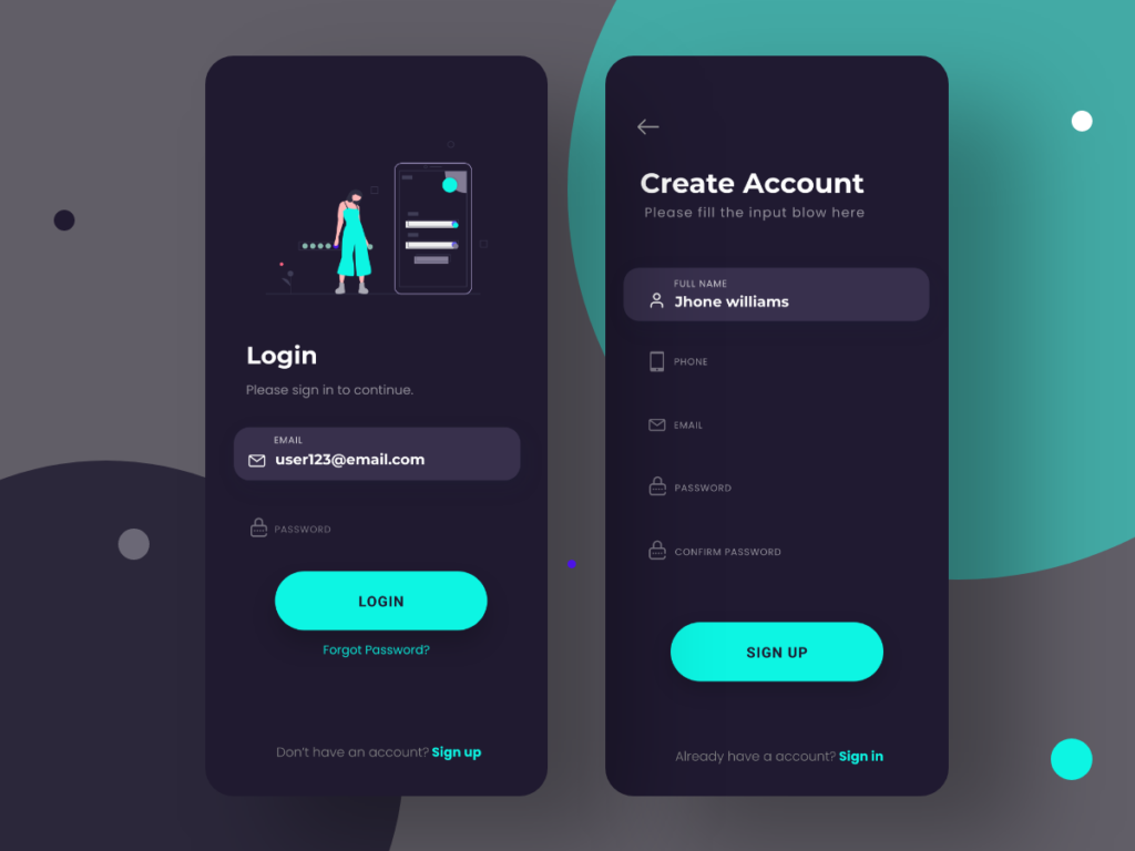
The dark mode is one of the biggest design trends that are already highly used in many applications. Recently, extensive developers have provided the opportunity to switch between standard mode and dark mode in applications. So users can choose the ones they like the most.
Dark theme design changes the background to dark mode and makes fonts and other elements light/white.
The dark mode is now available for most popular apps like Facebook. Switching to dark mode helps people reduce eye strain and navigate more comfortably.
4. 90’s Style
The style of the 90s influenced every field, down to the design of mobile applications.
Designers use retro fonts, images and graphics similar to popular 90’s PlayStation games (for example, Mario or Pac-Man). You have a chance to fascinate two generations with 90’s vibes: young people love old things and adults experience nostalgia.
This trend may not suit every product, but if it suits your application, definitely give it a try.
5. Typography
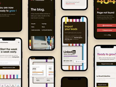
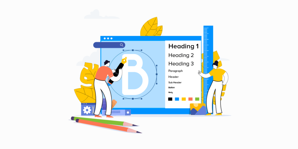
Choosing the right font is a crucial step in mobile app design. People often scan content on the Internet; they don’t read it. Therefore, it is worth using a font that will set the emphasis correctly.
Designers began to use unusual fonts. The text no longer looks so boring and does not fade into the background. Its purpose is to make the design brighter and more original.
Correctly selected fonts will help:
- set the tone and mood
- increase brand awareness
- provide a better visual experience
- improve readability
Give your app users a pleasant and readable user experience by editing typography: point sizes, line spacing, line length, tracking, and hierarchy.
Note that unconventional, “crazy” typography is not suitable for every product. Define the function that the text carries in your application. Do not experiment too much with fonts if they provide an additional and informative function. But, for example, in an online magazine, you can play with the formats, making the layout more interesting.
6. AR and VR
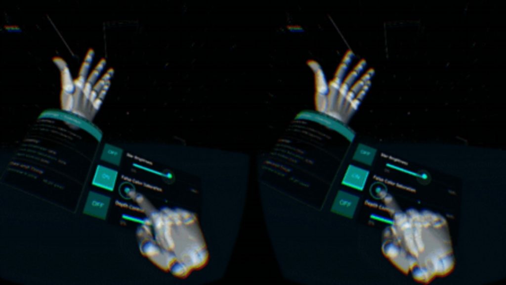
Virtual reality and Augmented reality give you this incredible opportunity to have interactive experiences just from your mobile phones. The app design trend has manifested itself, especially during quarantines and has replaced real activities for people staying at home.
In the coming year, this magical UI mobile design trend tends to grow and spread. The key to this design trend is that the app’s interface makes you feel like you’re inside the app. Engaging design elements and gamification are key to this experience.
It’s a great chance to combine the previous trends we’ve discussed, such as animation and 3D effects. First, well-created animation and 3D touches can support VR in your app design.
Remember Instagram’s engaging filters that let us place different characters wherever we want, just through the app and the mobile camera? Then you know how fun this can be. Moreover, it can be not only fun but also productive.
7. Abstract Art
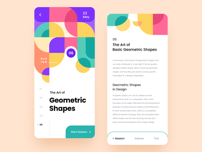
Abstract images and geometric art look very artistic on mobile apps. It draws attention to colours and shapes without detracting from application functionality and creating an original design. No need to resort to expensive photos and real photos or illustrations. This is the easiest way to grab users’ attention quite firmly.
Of course, it is not possible to follow all design trends. One approach is suitable for one type of business and may disrupt another. The critical point is to follow the trend, evaluate the market and analyze the demands of your customers.


